


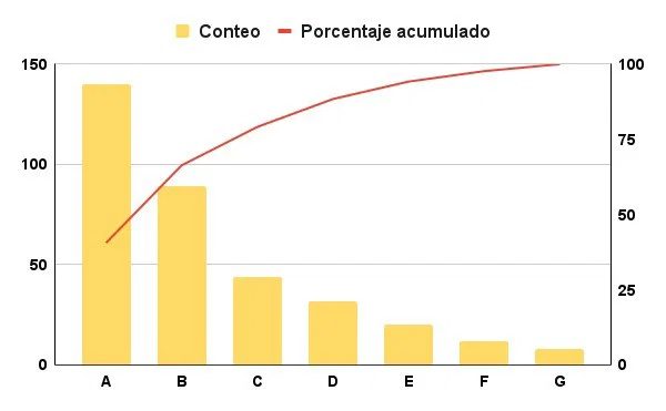
A Pareto chart is basically a bar chart where the bars are ordered from the highest value to the lowest value. This visual tool didn’t just appear out of nowhere. It goes back to Vilfredo Pareto, an economist of the late 19th and early 20th centuries. Money was not his only goal. Although he contributed in many fields, his best-known legacy remains this way of looking at data.
Why is this important to you? Because it helps you find the root cause of the problem.
You may have heard of a technique called Pareto distribution or ABC analysis. This is sometimes called a closed curve. Regardless of the name, the purpose is the same. Identify the main factors behind certain events and phenomena.
Why use Pareto charts in business?
Companies prefer this approach. It’s not just pretty to look at. It’s about optimizing operations. If you want to improve your daily productivity, this chart shows you where to start.
But don’t think this is limited to the boardroom.
There are also other practical applications. It can be used for market research. Helps to understand audience behavior. This logic applies to any situation where you have a large amount of data and need to find a few key factors that lead to the most results.
Think about the last time you tried to solve a recurring problem. Want to start fixing everything right away? Probably not. You can also look for the biggest leaks first. That’s exactly what this chart does. Separates the signal from the noise.
The Pareto chart sorts the elements from highest to lowest to highlight the most important elements.
It’s a simple concept. Bars decrease in height. The most important content is shown on the left. Less important content appears on the right. This structure forces you to prioritize. Large bars cannot be ignored.
This approach eliminates confusion. Convert raw data into clear action plans. If you want to know why your sales are falling or your customer service calls are skyrocketing, the answer is usually hidden in the first two or three categories.
The beauty is in its simplicity. You don’t need advanced stats to get value here. You just need to know how to sort the data. The story tells itself once the bars are ordered.
This is just the beginning. Understanding the diagram is the first step. Collecting the right data is another step. Next, I will explain the mechanism.
The 80/20 Rule in Action: Why Movie Theaters Lose Customers
The Pareto chart visually proves the Pareto Principle. This rule of thumb is that 80% of the effects come from 20% of the causes. If you want to fix a leaky business model or improve your learning process, this diagram shows you exactly where to start. It filters out the noise and highlights the vital few issues dragging down your results.
Case Study: Why Customers Don’t Return
Consider a local movie theater facing an existential crisis. They noticed a pattern where people came once and never came back. To stem the bleeding and avoid an immediate shutdown, management declined to speculate. They handed out forms.
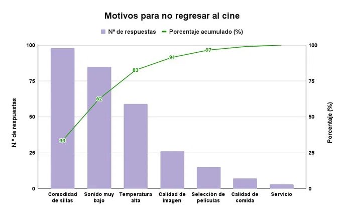
Customers can choose up to three reasons for not returning. The data collected from 293 respondents tells a hard story about what really matters to an audience.
Breaking Down the Data
The survey results reveal a clear hierarchy of dissatisfaction. It wasn’t just one thing that killing the vibe. It was a cascade of specific failures.
| Reason for Not Returning | Number of responses | Individual % | Cumulative % |
|---|---|---|---|
| Uncomfortable seats | 98 | 33.4% | 33.4% |
| Small Quantity | 85 | 29.0% | 62.5% |
| High Temperature | 59 | 20.1% | 82.6% |
| Image Quality | 26 | 8.9% | 91.5% |
| Movie Selection | 15 | 5.1% | 96.6% |
| Food Quality | 7 | 2.4% | 99.0% |
| Service | 3 | 1.0% | 100% |
| Total | 293 | 100% |
Interpreting the Pareto Chart
When you plot these numbers, the “vital few” quickly emerge.
The first category, Uncomfortable seats, accounts for almost a third of all complaints. Adding low sound volume accounts for 62.5% of all negative feedback.
“Fix the seats and the speakers, and you have addressed the majority of the problem.”
This is the power of Pareto charts. They found that improving cinema comfort and acoustics could solve more than 60% of customers’ attrition problems. They do not need to worry about the temperature yet. The third factor, high temperature, pushes the cumulative total to 82.6%.
After that? The curve flattens. Image quality, selection, food and service together make up less than 20% of complaints.
Strategic Implications
Most companies waste resources trying to solve all the problems at once. They have painted the lobby (service/photo), the chairs are falling apart (seats). Pareto charts prevent this.
It forces a prioritization strategy.
1. Immediate Fix: Replace or repair seats.
2. Secondary Fix: Upgrade the sound system.
3

When convenience kills loyalty
We identified three major flaws that the movie theater example illustrates. But let’s look at another scenario. The same applies here.
Consider an ice cream shop. We offer 14 different flavors. The goal is simple. Maximize your profits. Minimize waste. To do this, we need to know what people actually buy. It’s not just chocolate and vanilla. the real preferences.
During the month, the store tracked every single scoop sold. The data is returned to the table.
Here is what the numbers said:
- Cookies and cream topped the list with 294 units sold. That is 25.7% of the total.
- Next came pineapple, which sold 251 pieces. That brings the cumulative total to 47.7%.
- Caramel added 204 sales. Now we are at 65.5%.
- Strawberry contributed 167 sales. The cumulative percentage hits 80.1%.
Pistachio had only 102 sales.
“Others” accounted for 125 sales.
Total sales for the month were 1,143 units.
If you plot this on a Pareto chart, the pattern is unmistakable. The four best flavors (cookies & cream, pineapple, caramel and strawberry) make up about 80% of total sales.
Applying the 80/20 rule
This is the most basic form of the Pareto principle. The vital few.
Most people stop at 80%. But look at the cumulative column. Only 3 items are needed to reach 65.5%. Four items push you to 80.1%. The drop-off after strawberry is sharp. Pistachios are a niche product. “Other” is a catch-all category that dilutes the data but doesn’t drive volume.
The business impact is clear. By reducing the amount of pistachios you use and diversifying into “other” varieties, you can save on storage and spoilage costs. They double down on the top four.
Why is this important for learning?
Because most students try to learn everything equally. Every chapter. Every topic. This is ineffective. It is exhausting. And that creates diminishing returns.
You need to identify the 20% of concepts that drive 80% of your understanding. Then focus on that.
How to apply it to your daily learning
First, list all the topics in your current course. Be honest.
Next, let’s look at the past exams. See project requirements. What themes appear most often? Which ones carry the most weight in grading?
These are your “cookies and cream”. Your high-yield subjects.
Ignore the rest for now. Master the profitable topics first. Once you have those locked down, you can afford to skim the rest. You don’t have to be an expert in every field. You need to be proficient in the core material.
This has nothing to do with laziness. It’s all about strategy.
Spending 3 hours on a topic that accounts for 5% of your grade is a waste of time. Spend these three hours on a topic that is 20% of your grade. The return on investment is immediate.
A Pareto chart is not
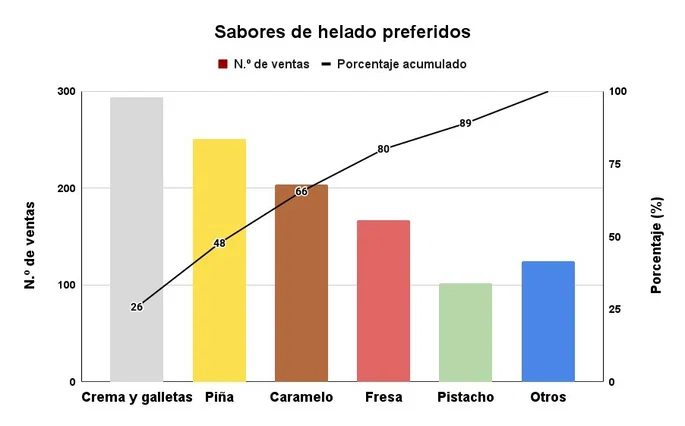
Los sabores que realmente mueven la aguja son crema y galletas, piña, caramelo y fresa. Juntos, representan el 80% de las ventas totales (dejando fuera chocolate y vainilla). La decisión de la empresa fue clara: dejar de comprar ingredientes en cantidades iguales. Se enfocaron en esos cuatro sabores. El resultado? Mayores ganancias.
Esto no es casualidad. Es la aplicación práctica del principio de Pareto.
Cómo hacer un diagrama de Pareto paso a paso
Crear este gráfico no requiere magia. Solo datos ordenados. Sigue estos pasos para construir tu propio análisis de Pareto.
1. Recopila las causas
Identifica todas las razones por las que ocurre un problema o fenómeno. Escribe cada causa en una hoja de cálculo, ya sea Excel o Google Sheets. Cada causa será una categoría individual.
2. Elige la unidad de medida
Decide qué vas a cuantificar. Puede ser el número de ventas, ingresos, gastos, personas afectadas o incluso reacciones positivas y negativas. La clave es que sea medible.
3. Ordena y cuantifica
Lista las causas de mayor a menor cantidad. Si tienes demasiadas categorías, agrupa las menos relevantes bajo el título “Otros” al final de la tabla. Esto limpia el gráfico de ruido innecesario.
4. Calcula el porcentaje individual
Para cada causa, determina su peso relativo. Por ejemplo, si 98 personas señalaron la incomodidad de las sillas como problema principal, y el total de respuestas fue de 293, el cálculo es simple:
$98 / 293 = 33.4\%$
5. Calcula el porcentaje acumulado
Suma los porcentajes individuales progresivamente. La primera categoría mantiene su 33.4%. La segunda categoría (digamos, “sonido muy bajo”) suma su propio porcentaje al de la primera. En el ejemplo, el acumulado llega al 62.5%. Es una suma continua que muestra el impacto creciente de las categorías principales.
6. Traza las barras
Dibuja un diagrama de barras. El eje horizontal muestra las causas ordenadas de mayor a menor, de izquierda a derecha. El eje vertical izquierdo muestra el conteo real.
7. Añade la línea de porcentaje acumulado
Usa el eje vertical derecho para la segunda escala. Traza una línea que conecte los puntos del porcentaje acumulado. Esta línea suele seguir una curva que recuerda a una función logarítmica creciente.
Qué buscar en el gráfico final
El diagrama de Pareto tiene características visuales muy específicas que debes leer correctamente.
La regla de la izquierda
La categoría con el conteo más alto siempre está a la izquierda. El resto desciende. No importa si la última categoría antes de “Otros” tiene un conteo menor que “Otros” mismo; se deja al final porque agrupa múltiples causas menores.
Colores y formas
Las barras pueden ser todas del mismo color o usar diferentes tonos para distinguirlas mejor. Lo inamutable es la combinación de barras (para conteos) y una línea (para el porcentaje acumulado).
Identificar el foco
Este recurso es útil porque identifica visualmente las causas principales de un suceso. No te distrae con el ruido de las categorías menores. Te señala exactamente dónde poner los recursos para obtener el mayor impacto.
La línea de porcentaje acumulado cruza el 80% en algún punto. ¿Dónde cae? Ahí está la clave de la eficiencia. Si la línea llega al 80% con las primeras dos o tres categorías, tienes un foco claro. Si el 80% se alcanza con diez categorías, tu problema es más difuso.
No hay que ignorar la cola. Pero tampoco hay que perder tiempo resolviendo problemas que aportan poco. El gráfico te dice qué dejar de ignorar. Y qué empezar a optimizar hoy.


