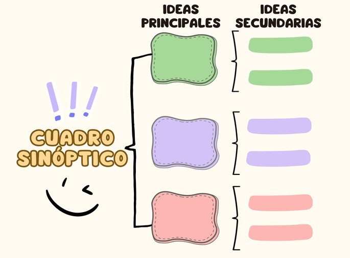
A cuadro sinóptico is more than just a fancy chart. It is a visual tool designed to organize information so your brain can actually process it. Think of it as a map for your thoughts. Instead of reading through page after page of dense text, you break ideas down into a hierarchy. This makes complex subjects easier to understand. It also helps with retention. When you see how concepts relate, you remember them better than when you just highlight random sentences.
Why Visual Organization Works
The human brain struggles with unstructured data. We lose track of the main point when everything looks the same. A cuadro sinóptico solves this by showing rank. It places the most important idea at the top. Then it branches out into smaller categories. This visual hierarchy allows you to scan a topic in seconds. You see the big picture first. Then you drill down into details. This structure reduces cognitive load. You are not memorizing isolated facts. You are memorizing a system.
How to Build One Quickly
You do not need special software. A pencil and paper work fine. Digital tools are faster for editing. Start with the central concept. Write it in a box at the top. Draw a vertical line down. Then add horizontal lines to branch out. Each branch gets a sub-topic. Continue this process until you reach the smallest details. Use brackets or braces to connect related items. Keep text brief. Bullet points are best. Long paragraphs destroy the flow.
Common Mistakes to Avoid
People often clutter their cuadro sinóptico with too much text. This defeats the purpose. If you write full sentences, you might as well read the book. Use keywords only. Another error is skipping the hierarchy. If every box is equal size, you have created a list, not a diagram. The main idea must stand out. Sub-ideas should be smaller. Details should be the smallest. This visual cue tells your eye where to look first.
When to Use This Technique
This method shines with dense material. History timelines work well. Scientific classifications are perfect for it. Legal frameworks benefit from clear branching. Students often use it for exam prep. Teachers use it to explain complex units. It works best when you are reviewing known material. It is not good for initial discovery. You need to understand the content before you can structure it. Try it after your first read-through. It solidifies what you just learned.
The goal is clarity. Not decoration. If the chart looks pretty but confuses you, it is useless. Make it functional. Make it fast. Make it yours.
Un cuadro sinóptico no es solo un dibujo con líneas. Es una forma de poner orden en el caos mental. Empezamos con un concepto central. Luego, desglosamos las ideas principales, organizándolas de mayor a menor importancia. La información se ramifica hacia abajo, hasta llegar a los detalles secundarios o complementarios.
Visualmente, esto se traduce en una estructura jerárquica. Cada nivel refleja una categoría distinta. Las líneas o llaves conectan lo general con lo específico. Así, las relaciones entre conceptos quedan claras de un vistazo.
Un cuadro sinóptico organiza la información visualmente, mostrando claramente los niveles de categoría y sus conexiones lógicas.
Por qué funciona esta herramienta
En el ámbito educativo, la utilidad es obvia. Permite estudiar temas complejos de forma rápida. Identificas las ideas clave sin perderte en el texto. No tienes que releer párrafos interminables para encontrar el núcleo del asunto.
Pero su uso no se limita a la escuela. El sector empresarial también la utiliza. ¿Por qué? Porque la organización visual de ideas ayuda a establecer jerarquías de puestos o a mapear pasos en un proceso operativo. Saber qué es prioritario y qué es secundario salva tiempo. Y en el trabajo, el tiempo es dinero.
Cómo hacer un cuadro sinóptico paso a paso
No necesitas software caro. Un cuaderno y un bolígrafo funcionan. La técnica es sencilla si sigues este orden:
- Elige el tema principal. Escribe la idea central en la parte superior izquierda o derecha de la hoja, dependiendo de si usarás llaves hacia la derecha o izquierda.
- Identifica las categorías principales. Piensa en los grandes bloques que componen ese tema. Escríbelos en la siguiente columna o fila, alineados vertical u horizontalmente.
- Añade las subcategorías. Debajo de cada categoría principal, desglosa las ideas más importantes. Estas deben estar ligadas directamente a su superior.
- Incluye los detalles secundarios. Por último, añade la información complementaria. Los datos más específicos o ejemplos van en el nivel más bajo de la jerarquía.
La clave está en la lógica. Cada rama debe depender de la anterior. Si una idea no está relacionada con la categoría principal, no pertenece ahí. La claridad visual depende de esta estructura rígida pero flexible.
Consejos para evitar errores comunes
Muchos estudiantes confunden el cuadro sinóptico con el mapa conceptual. La diferencia es sutil pero importante. En un mapa conceptual, las conexiones pueden ser transversales y menos jerárquicas. En el sinóptico, la jerarquía es estricta. Mayor a menor importancia. Sin saltos arbitrarios.
También evita poner demasiado texto. Si cada rama es un párrafo, has fallado. Usa palabras clave. Frases cortas. La idea es que el ojo recorra la información, no que la lea como un libro.
¿Te cuesta visualizar la estructura? Empieza por lo más obvio. Lo que sabes que es central. Luego, añade lo que lo sustenta. No intentes meter todo
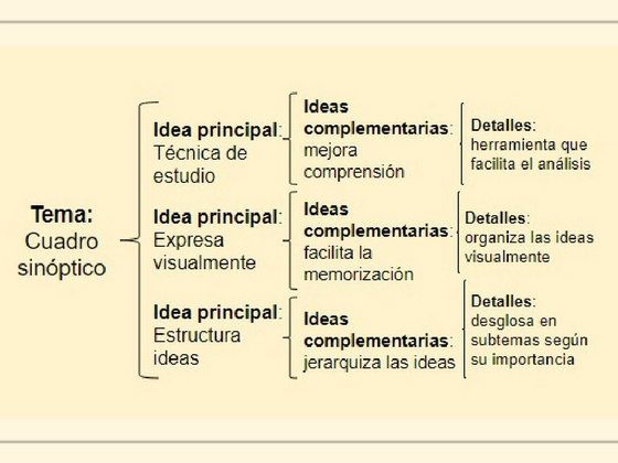
How to build a concise study aid that actually works
You cannot skip the groundwork. Before you draw a single line, you need a working knowledge of the subject. This background knowledge is what allows you to spot the core concepts versus the filler. Without it, you are just rearranging words without understanding their weight.
Start by isolating the main ideas. Pick one. Then, bundle the supporting details and secondary points that belong to it. Order them by importance. Repeat this for every major concept until your mental map is complete.
When you are ready to draw, place the topic at the center or on the far left. Open a brace or bracket. List your main ideas immediately inside. From those, branch out into the secondary details. Keep the flow unidirectional. Left to right works best for most people because it mimics reading order. This spatial arrangement makes the hierarchy obvious at a glance.
Keep notes under each point extremely brief. The goal is compression. If you are writing paragraphs, you are doing it wrong.
Why structure matters in visual learning
A well-made diagram forces you to synthesize. It takes a sprawling topic and strips away the noise. The result is a clean, organized view of the subject.
This format relies on strict hierarchy. You have the main concept, then the secondary points, then the minor details. The connections are made using graphical elements like braces, brackets, or arrows.
Unlike a mind map, a diagram sticks to text. No icons. No pictures. Just words and lines. This constraint is a feature, not a bug. It forces clarity. If you can’t express the idea in a few words, you don’t understand it well enough yet.
The structure is lightweight. This lightness makes it easier to scan. You can grasp the entire structure of a chapter in seconds. It trains your brain to classify information logically.
The function of visual hierarchy
The primary job is to reduce complexity. You are taking a large amount of information and finding the skeleton.
It helps you see the relationships between concepts. By ordering them by importance, you know what to memorize first. This supports visual memory. Your brain retains the shape and layout of the information better than a block of text.
For teachers, it is a planning tool. For students, it is a study guide. It organizes chaos into a manageable format.
Choosing the right layout
There are two ways to categorize these diagrams.
First, by the graphic element used. You might use braces, brackets, or arrows.
Second, by the direction of the flow. You can arrange them horizontally, vertically, or radially.
How to use braces for clarity
Braces are the most traditional method. They visually group items together under a single parent idea.
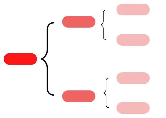
Cuadro sinóptico o esquema de corchetes
The cuadro sinóptico o esquema de corchetes flips the script on traditional hierarchy. Instead of relying on those big, sweeping curly braces { } to group things, you use vertical lines or brackets on the left margin. It’s less cluttered. Cleaner.
Here is how it actually works in practice:
- Start with your main idea on the far left.
- Draw a vertical line next to it.
- Branch out to secondary ideas on the right.
- If a secondary idea has sub-points, draw another vertical line specifically for that branch.
This format forces you to be concise. You don’t have space for paragraphs. You are forced to distill the core concept.
When to use this specific structure
You should choose this method when your content has clear, distinct categories but lacks deep, nested complexity. Think of it as a bridge between a simple outline and a complex mind map.
Best use cases:
* Comparing two or three distinct options.
* Listing the stages of a process.
* Outlining the components of a system.
If you find yourself writing long sentences inside the boxes, you are using the wrong tool. Switch to a mind map. If your list is just five items with no sub-points, a bulleted list is faster. The esquema de corchetes lives in that middle ground where you need visual separation but not heavy graphical weight.
Why the visual separation matters
There is a reason this format sticks. Human brains process spatial relationships faster than linear text. When you see a vertical bracket grouping three items under one header, your brain instantly categorizes them as “related” without you having to read every word first.
This reduces cognitive load.
For students cramming for exams, this is huge. You can glance at the left side and see the skeleton of the argument. The details are there if you need them, but they don’t dominate the page.
How to structure it effectively
Don’t just draw lines randomly. Follow a strict logic or the whole thing becomes visual noise.
- Identify the primary concept. This gets its own column.
- Break it down. Identify the next level of abstraction. These get their own vertical section.
- Detail. If a point needs explanation, keep it to one line. No exceptions.
If a sub-point requires a paragraph, stop. That information does not belong in a synoptic chart. It belongs in your notes or your essay. The chart is a map, not the territory.
Common mistakes to avoid
Many people try to force too much text into these brackets. It creates a wall of words that defeats the purpose.
- Mistake: Writing full sentences.
-
Fix: Use noun phrases. “Causes of inflation” instead of “One of the main causes of inflation is…”
-
Mistake: Inconsistent indentation.
-
Fix: Keep your vertical lines aligned. If a sub-point jumps to the right, the line must move with it.
-
Mistake: Mixing styles.
- Fix: Don’t use curly braces in one section and square brackets in another. Pick one
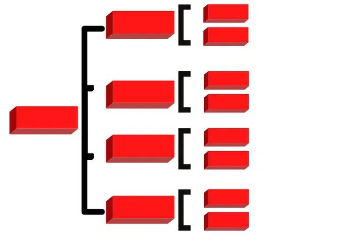
Cuadro sinóptico con corchetes: la estructura compacta
The cuadro sinóptico con corchetes (synoptic chart with braces) is designed for one thing: hierarchy without the clutter. You aren’t writing paragraphs here. You are listing core concepts using minimal words. This keeps the visual footprint small. The result is a dense, easy-to-scan map of logic. If you want to see how a main idea breaks down into sub-points, this format forces clarity. You strip away the fluff. You are left with the skeleton of your argument.
Cuadro sinóptico o esquema de flechas
Not every topic needs braces. Sometimes you need direction. The cuadro sinóptico o esquema de flechas (synoptic chart or arrow scheme) handles processes and relationships better than static boxes. It shows movement. It shows cause and effect. Where braces tell you what something is, arrows tell you what happens next.
Which one do you choose?
Use braces when you are categorizing. Use arrows when you are explaining a timeline or a workflow. Students often mix them up, leading to confusing notes that look more like a web than a map.
Why arrow schemes work for complex flows
If you are studying a scientific process, like photosynthesis, boxes might not show the energy transfer clearly. Arrows do. They link the reactants to the products. They show the flow of information in a feedback loop.
- Clarity in sequence: You can see step one lead directly to step two.
- Visual direction: The eye follows the arrow, not a static grid.
- Flexibility: You can branch off in multiple directions without creating a messy cluster.
How to draw an effective arrow scheme
Start with the main subject on the left. Draw a single arrow to the next major concept. From there, split into secondary arrows for details. Keep the lines straight. Avoid curves if you can. Curves look decorative, not functional.
Don’t overload the path with text. If an arrow needs a paragraph to explain it, you have failed. Break that idea into a new branch. Use concise phrases. The structure should guide the reader, not force them to decode a tangle of lines.
This isn’t about art. It’s about reducing cognitive load. When you study, you don’t want to figure out where to look next. You want the path to be obvious.
Is your diagram helping you understand, or just occupying space? If you find yourself squinting to follow a line, redraw it.
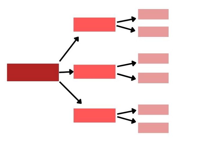
Cuadro sinóptico vertical
La versión vertical sigue la misma lógica jerárquica pero cambia la dirección del flujo. En lugar de moverse hacia la derecha, las ideas bajan.
La estructura es simple. La idea principal se coloca en la parte superior. Desde allí, las ramificaciones se despliegan hacia abajo. Cada nivel adicional representa una subcategoría o un detalle complementario.
This format mirrors how we naturally break down problems: top-down, from general to specific.
Why choose this layout? It works well for long lists or when horizontal space is limited. You can stack concepts vertically without the diagram becoming too wide for a page or screen.
When to use each type
Choosing between horizontal and vertical isn’t about right or wrong. It’s about context.
- Horizontal : Best for presentations or when you want to show a process or sequence. It mimics reading direction.
- Vertical : Ideal for deep dives into a single topic. Good for detailed notes where hierarchy matters more than flow.
The role of arrows
Arrows in these charts serve a specific function. They guide the eye.
In a cuadro sinóptico con flechas, the arrows indicate relationship strength or direction. They connect the main idea to supporting facts. But don’t overuse them. Too many arrows create clutter.
Use them to show:
– Cause and effect
– Direct classification
– Key dependencies
For informal notes or quick study sessions, arrows add clarity. For formal reports, clean lines or brackets might be cleaner.
Making it work for you
Start with the core concept. Write it in a box at the top (vertical) or left (horizontal).
Then, ask: what supports this?
Add the next layer. Keep it concise. Use keywords, not full sentences.
If the chart gets too dense, split it. Two smaller charts are better than one unreadable mess.
The goal is synthesis. Not decoration.
Which method feels more natural for your next study session?
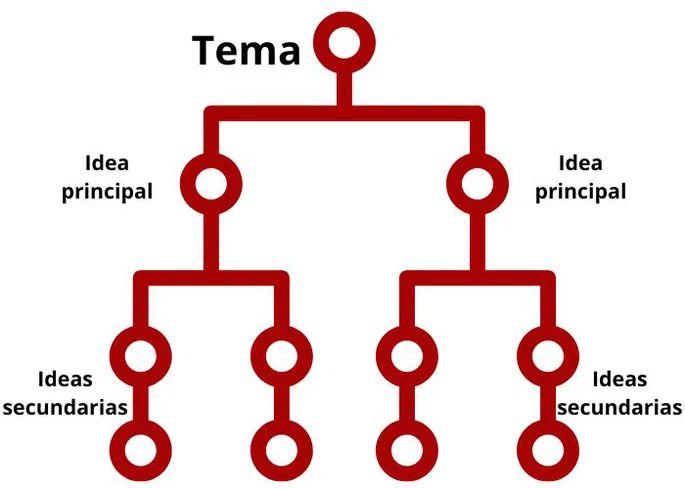
Los cuadros sinópticos verticales funcionan como una caída libre de información. Pones el tema principal en la cúspide. Desde ahí, la estructura se divide hacia abajo. Las ideas principales cuelgan directamente del tronco. Más abajo, los conceptos secundarios y complementarios se expanden. Es un sistema de cascada.
Esta disposición no es solo para estudiantes. Se usa mucho para mostrar jerarquías en empresas o grupos. Pero su verdadera potencia está en la didáctica. Ayuda a visualizar lo que normalmente es abstracto.
Cuadro sinóptico radial
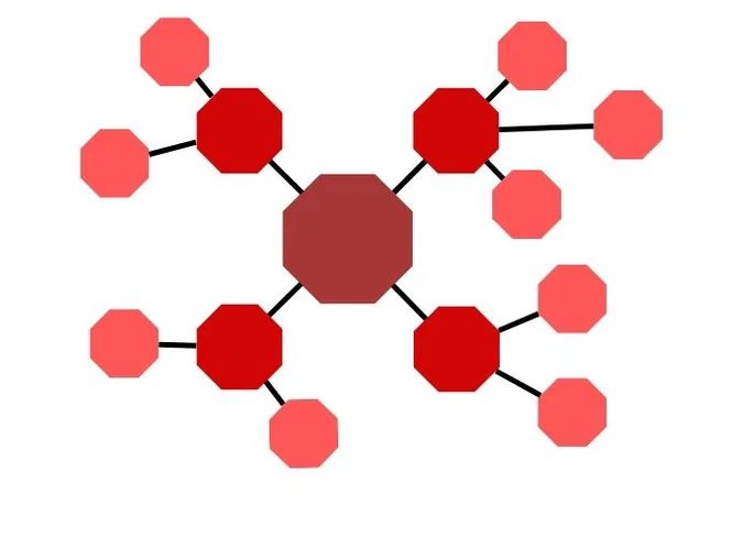
No toda la información debe caer en línea recta. El cuadro sinóptico radial ofrece una alternativa. Parte de un centro. Las ideas se dispersan hacia afuera.
La clave es la distancia. Las ideas secundarias se ubican cerca del núcleo. Las complementarias, más alejadas. Esta separación espacial comunica jerarquía sin necesidad de flechas o cajas complejas. Si la idea está lejos, es menos central. Si está cerca, es más fundamental.
Cuadro sinóptico vs mapa conceptual: cuál elegir
Ambas herramientas sirven para ordenar el caos mental. Ambas ayudan a aprender. Pero no son intercambiables. La diferencia radica en la forma de representar las ideas.
Un cuadro sinóptico es estricto. Se basa casi exclusivamente en palabras. Usa pocas figuras gráficas. Exige una jerarquía rígida. De mayor importancia a menor, de arriba abajo o del centro hacia afuera. No hay lugar para la ambigüedad.
El mapa conceptual es el paraguas. Engloba cuadros sinópticos, mapas mentales, diagramas e infografías. Es un término paraguas para cualquier representación visual de ideas.
Aquí está el quid de la cuestión: los mapas conceptuales no requieren jerarquía estricta. En un mapa mental, muchas ideas pueden existir en el mismo nivel. Se relacionan entre sí sin una cadena de superioridad. Hay libertad para colocar conceptos en cualquier punto del espacio.
Diferencias prácticas
- Jerarquía: El cuadro sinóptico la exige. El mapa conceptual la permite, pero no la obliga.
- Recursos: El cuadro usa poco más que texto y líneas. El mapa puede incluir imágenes, colores y formas diversas.
- Estructura: El cuadro es lineal o radial. El mapa es libre, conectado por nodos.
Si necesitas claridad absoluta y orden estricto, usa un cuadro sinóptico. Si buscas conexiones laterales y creatividad visual, el mapa conceptual es tu vía.
Otras herramientas de estudio
El cuadro no es la única opción. Existen muchos métodos para organizar el conocimiento. Dependiendo de cómo funcione tu cerebro, algo más podría encajar mejor.
La elección de la herramienta define cómo procesas la información. No se trata de estética, sino de claridad mental.
Explorar estas alternativas puede revelar qué sistema se adapta mejor a tu estilo de aprendizaje. La flexibilidad es clave para el estudio efectivo.
Text-heavy notes aren’t always the answer. Sometimes you need to break free from linear paragraphs to truly grasp complex material. This is where visual study tools come in. They don’t just organize information; they restructure it. The goal is deeper comprehension through different grouping methods and emphasis on specific concepts or processes.
Three standout tools deserve attention for how they handle data. They differ in structure, visual weight, and logical flow.
Visual Impact: The Infographic
If you need to digest information quickly, an infographic is your best friend. It’s not just pretty pictures. It’s a strategic mix of graphs, illustrations, images, and concise explanatory text. The visual appeal isn’t a gimmick. It’s a cognitive aid. By pairing data with visuals, you reduce the mental load required to process raw numbers or dense text.
Think of it as a snapshot. It captures the essence of a topic without forcing you to read paragraphs. This is especially useful for marketing trends, scientific cycles, or step-by-step procedures where seeing the relationship between elements is more powerful than reading about them.
Radial Thinking: The Mind Map
Mind maps operate differently. They are radial. You start with a central theme and branch out. There’s no strict hierarchy at the top level. Instead, you associate ideas freely around that core concept. This mimics how your brain actually works. It doesn’t store memories in neat, numbered lists. It creates networks of association.
When you’re trying to brainstorm or connect disparate ideas, a mind map shines. It allows for non-linear thinking. You can jump from a main idea to a sub-point, then to a seemingly unrelated concept, and find the hidden link. It’s ideal for creative projects, literature analysis, or understanding complex systems where context matters more than sequence.
Flow and Function: The Diagram
Then there are diagrams. These are all about structure and movement. They emphasize processes, hierarchies, functions, and operations. The most recognized form is the flowchart, but diagrams cover a broader range. They show how things work. Where a mind map shows association, a diagram shows causality or sequence.
Use a diagram when you need to understand a workflow. It breaks down a large operation into its component parts. You can see the inputs, the transformations, and the outputs. It highlights dependencies. If one step fails, where does the chain break? A diagram makes that visible. It’s less about the beauty of the idea and more about the mechanics of it.
“Different content requires different grouping structures. Emphasizing specific concepts often requires shifting from linear text to visual spatial relationships.”
Choosing the Right Tool
You might encounter terms like organizer graphic, mind map, or comparative chart in your research. These are all part of the same family. The choice depends on your study goal.
- Need a quick overview? Go infographic.
- Need to brainstorm connections? Go mind map.
- Need to understand a process? Go diagram.
The references supporting these methods highlight their role in improving learning outcomes. From teacher training strategies to evaluating student competence, visual tools are recognized for their ability to enhance retention and understanding. They force you to interact with the material differently. You aren’t just copying. You’re reconstructing.
This isn’t